Responsive Design
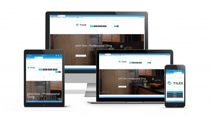
Never before has inCMS been so good in the are of Responsive Design
inCMS is now optimized for tablet and mobile use and works perfectly on any device of your choice.
Make a quick adjustments to your website while on the move?
That's no longer a problem - you'll be amazed by how easy it is to use!
Give it a try: You can find this new function in the menu bar, which can be resized and even hidden, allowing you to have a larger view of your workspace on mobile devices and tablets.
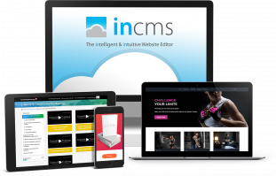
intelligent. intuitive. inCMS.
inCMS Suite
Editing Mode
Features
Responsive Design
Support & Training
Entdecken Sie das volle Potenzial von inCMS Komplettpaket!
