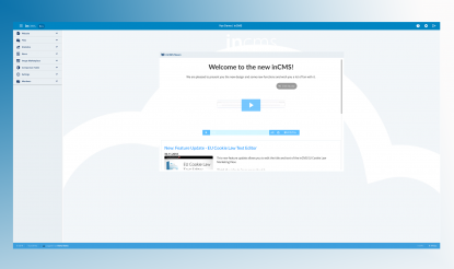
Welcome to the new inCMS!
Over the last months, our developers and designers worked - with a lot of commitment and enthusiasm - on a big update for the SwissMadeMarketing Apps.
Besides the new, more modern appearance of inCMS and Co, general improvements, and some new features, the update also lays the foundation for future developments through new technical possibilities.
The result is more than impressive - creating websites is even easier and even more fun now!

New Design
The update gives inCMS a completely new look and feel:
It now has a fresher, more modern and beautiful appearance, meeting today's design expectations. Additionally, it has a more user-friendly interface.
With that, inCMS doesn't just look different - it also feels different!
Editing Mode
While most of the functionality of inCMS remains the same, the editor has changed a lot - mainly visually.
However, our developers have added some great features that allow you to customize the editor to your needs.


Enable and disable editing
New: You can now activate or deactivate individual areas in the editor using a simple toggle function for editing.
After deactivating areas, they get displayed in preview mode and no changes can be made. Only if you chose to reactivate the areas, they can be edited again.
Editing View
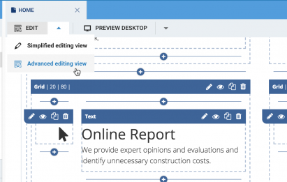
With just one click, you can now switch between a simplified and extended editing view.
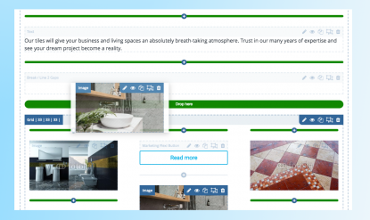
The simplified editing view looks more modern and is limited to a minimum of grids and lines, so that even while editing the website, a sort of preview of the final result is already visible.
The extended view has the advantage, that the individual modules are much more clearly separated from each other and the editing areas stand out more clearly. This view is particularly recommended for dark backgrounds.


Dark Mode
Another new feature is the newly integrated Dark Mode:
For the first time you have the possibility to select the theme in inCMS and change the user interface from light to dark. This particularly facilitates the use of inCMS in poor lighting conditions.
Responsive Design
There have once again been great improvements in the Responsive Design area of inCMS:
The application on tablets now works much better and the operation on mobile devices has been drastically optimized.
Making quick adjustments to your website while on the move?
That's no longer a problem - you'll be amazed by how easy it is to use!
Try out this new function in the menu bar, which can be resized and even hidden, allowing a larger overview of the editing space on mobile devices and tablets.

Do you have questions about the update or constructive feedback for our developers?
We look forward to hearing from you. Write to us: kuHn4uL94ObS4eX74eH-8-b3--Pg+ffm+-z1vPH9-w@nospam